Elements of navigation
Navigation is used for moving around the site and understanding where they are. A good website needs to have a clear navigation. Any page on your site should be within three clicks of any other page on your site. Your navigation should be intuitive and simple. Ease of navigation is one of the biggest keys to the usability of a website. If visitors can easily find what they are looking for they will be more likely to stay on the website rather than leaving and going to some other site. Effective navigation can help to increase page views, improve the user experience, and even increase revenue and profit.
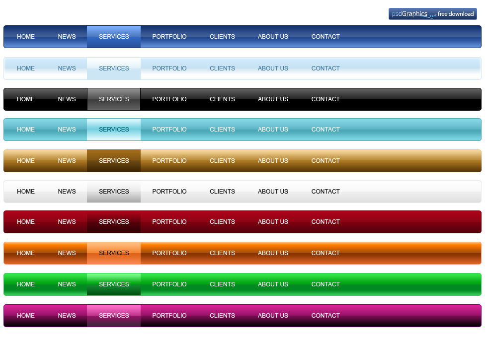
Two main site of navigation: Top of site or left column list.
A well-coded menu is important, otherwise it will make users frustrated. Visitors will lose interest depends on the first page they see. Menus should be no longer than 7+/- 2 items.
Categorization
Primary menu structure: 1.Category-nouns 2.Audience 3.Task-verbs
Secondary menu structure: 1.popularity 2.promotion 3. Location 4.Time 5.Alphabetical order.
According to Fitts’ Law: It is faster to hit larger targets closer to you than smaller targets farther from you. So elements every page should have a large page title. Home page needs to show off your most recent content. 3 main ways of displaying this information: 1.Scrolling 2.Sequential 3.Splitting.
To attract users: 1.We must put a summary of the page’s content in the first paragraph. 2.Make sure that page headings convey useful information. 3.Frontload headings and bullet points with the information-carrying words. Home page needs to show off your most recent content.
Conclusion
6 navigation guidelines:
- Clarity: Make sure that your navigation has a linguistic and semantic clarity that communicates to your users in an direct, efficient and adequate way.
- Simplicity: Avoid using technical labels and icons that no one recognizes. Speak the language of the user rather than using complex terms and form factors unfamiliar to your users.
- Saliency: Avoid having redundant and repetitive terms and shapes in your labels and icons that affects their intergroup saliency. This can easily influence your users ability to differentiate and interpret them as a whole.
- Context: Look at the consistency and standards for labels and iconography used in the context that you are designing for. It is more efficient for your users to recognize rather than needing to interpret information that is unfamiliar to them.
- Correlation: Avoid creating distracting stimulus through semantic interference between labels and icons. Reduce uncertainty and make sure that they clearly communicates one message as they are put together.
- Tonality: Ensure that the tonality of the message is still consistent at the end of the design work. Colors, typography and form heavily affect the way your audience conceive and interprets the information.
